How to Build a Small Business KPI Dashboard in 2026 Using Looker Studio and Google Sheets
A small business KPI dashboard helps you see what is happening across sales, marketing, operations, and cash flow without opening five different tools every Monday morning. For many small businesses, the problem is not a lack of data. The problem is that the numbers live in separate spreadsheets, inboxes, accounting exports, ad platforms, CRMs, and notes from team meetings.
When those numbers are scattered, owners make decisions from stale reports, gut feel, or one-off exports. That usually leads to slow reactions: a campaign underperforms for three weeks before anyone notices, invoices age past due, or the sales pipeline looks healthy until the close rate drops.
The practical starting point is simple: use Google Sheets as the clean data hub and Looker Studio as the visual reporting layer. This setup is especially useful for solo operators, service businesses, local companies, agencies, nonprofits, and 5-50 person teams that need better visibility without paying for a full business intelligence platform.
Google Sheets and Looker Studio are free to start. If you later need automated connectors for tools like Meta Ads, QuickBooks, HubSpot, Shopify, or other platforms, connector tools often range from about $20 to $100+ per month depending on data sources, refresh frequency, and account limits.
TL;DR: The Simple Dashboard Stack for 2026
- Use Google Sheets as the data hub. Keep the source data clean, owner-controlled, and easy to audit.
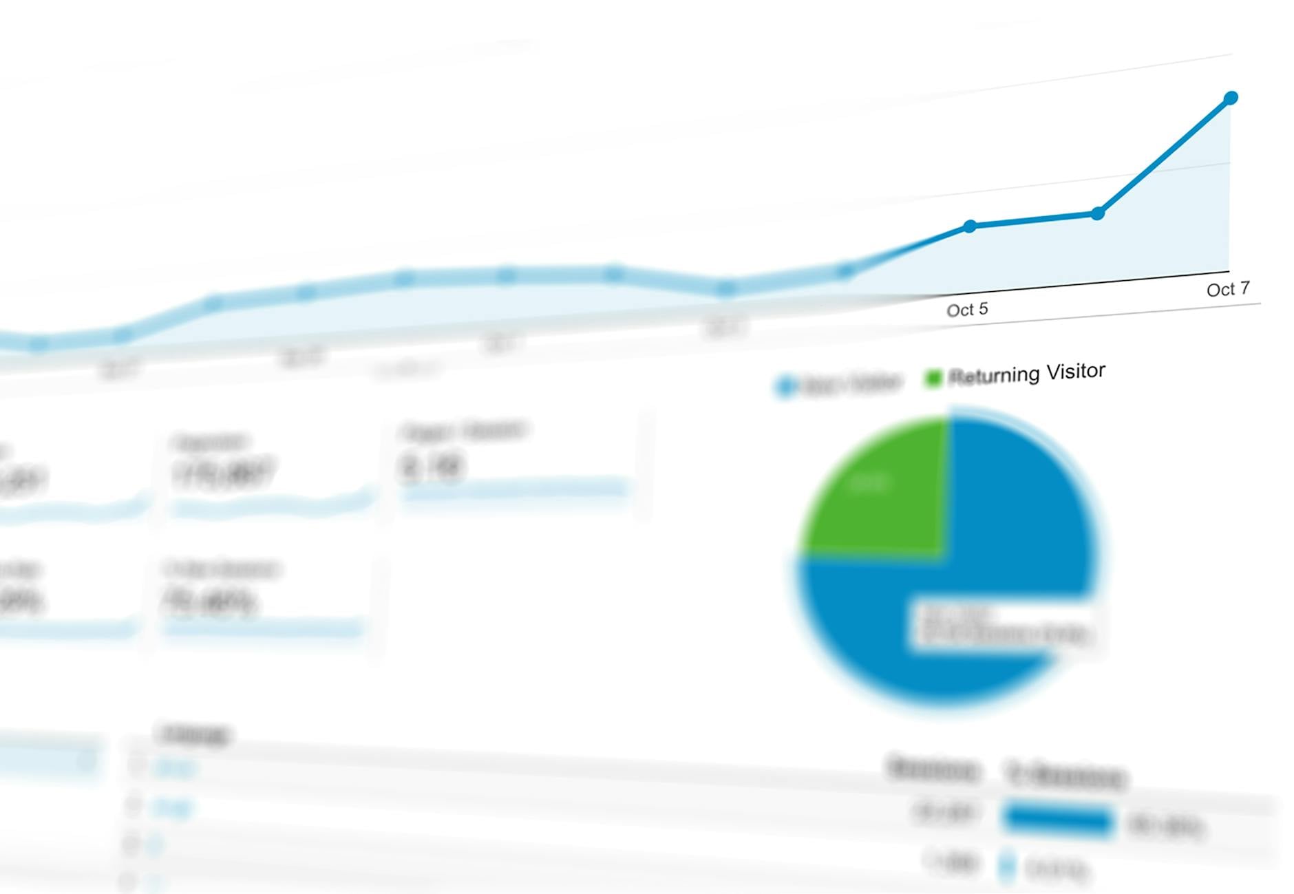
- Use Looker Studio for reporting. Turn rows into scorecards, charts, filters, and shareable dashboard pages.
- Start with 6-10 KPIs. A dashboard with eight clear metrics is more useful than 40 confusing charts.
- Build one executive page first. Include revenue, leads, conversion rate, average order value, customer acquisition cost, open invoices, and monthly trend.
- Automate later. Use tools like Zapier, Make, Coupler.io, Supermetrics, or native exports when manual updating becomes a real bottleneck.
Why Small Businesses Need a KPI Dashboard Before They Need More Software
It is tempting to solve every reporting problem by buying another app. But if your team cannot agree on the basic numbers, new software often adds another place where data gets trapped.
A KPI dashboard forces the business to answer practical questions first:
- Which numbers actually guide decisions?
- Where does each number come from?
- Who is responsible for keeping the data current?
- What action should happen when a metric changes?
For example, a local service business may not need a complex analytics stack. It may need one weekly view showing booked appointments, qualified leads, close rate, average sale value, unpaid invoices, and monthly revenue. That is enough to spot whether the issue is marketing volume, sales follow-up, pricing, fulfillment, or collections.
The dashboard does not replace your CRM, accounting software, or bookkeeping process. It gives owners and managers a single place to see current trends and decide what to do next.
Step 1: Choose KPIs That Match Business Decisions
Good KPIs are tied to decisions. Before adding a metric, ask: “What would we do differently if this number moved up or down?” If the answer is unclear, the metric may belong in a deeper report, not the executive dashboard.
Use a Problem → Solution → Outcome Lens
Here is a simple way to choose useful KPIs:
- Problem: Sales feel slow, but the owner does not know why.
- Solution: Track leads, booked appointments, proposals sent, and close rate.
- Outcome: The business can see whether the issue is lead generation, follow-up, or closing.
Another example:
- Problem: Cash flow feels tight even when revenue looks strong.
- Solution: Track open invoices, overdue invoices, average collection time, and monthly revenue.
- Outcome: The owner can separate a sales problem from a collections problem.
Recommended Starter KPIs
Most small businesses can begin with these metrics:
- Monthly revenue
- Gross margin estimate
- New leads
- Conversion rate
- Average sale value
- Repeat customer rate
- Website sessions
- Top traffic source
- Unpaid invoices
- Booked appointments
Separate leading indicators from lagging indicators. Leads, appointments, proposals, and response time help predict future revenue. Revenue, profit, and completed sales confirm what already happened. A useful dashboard includes both.
Avoid the common mistake of tracking everything because it is available. If a metric does not help you change a decision, remove it from the first version.
Step 2: Set Up Google Sheets as Your Dashboard Data Source
Looker Studio works best when the connected Google Sheet is clean and consistent. The goal is not to make a beautiful spreadsheet. The goal is to create a reliable table that a reporting tool can understand.
Create one workbook with separate tabs for major business areas:
- Sales
- Marketing
- Operations
- Finance
- KPI Targets
- Data Dictionary
Use Clean Header Rows
Each tab should have one clear header row. Useful fields might include:
- Date
- Source
- Customer Type
- Revenue
- Cost
- Status
- Owner
- Notes
Keep dates in one consistent format. Avoid merged cells, blank header columns, color-coded meaning with no text value, and totals mixed into raw data. Looker Studio expects structured rows, not a spreadsheet designed mainly for visual reading.
Add a KPI Targets Tab
Your dashboard becomes more useful when it compares actual performance against goals. Add a KPI Targets tab with monthly goals such as:
- Revenue target
- Lead target
- Conversion rate target
- Average response time target
- Invoice collection target
For example, a simple targets sheet could include columns for Month, Revenue Target, Lead Target, Close Rate Target, and Collection Target. That gives Looker Studio something to compare against actual results.
Create a Data Dictionary
A data dictionary is a plain-language reference for your team. It explains what each field means, where the data comes from, and how often it should be updated.
For example:
- Revenue: Closed sales recorded for the month, before expenses.
- Lead Source: The original channel that brought in the inquiry, such as Google Ads, referral, organic search, or email.
- Status: Current sales stage, such as New, Contacted, Proposal Sent, Won, or Lost.
Action step: Before connecting anything to Looker Studio, spend 30 minutes cleaning one sheet. Remove merged cells, standardize dates, confirm headers, and make sure each row represents one record.
Step 3: Connect Google Sheets to Looker Studio
Once the sheet is clean, connect it to Looker Studio.
- Open Looker Studio.
- Create a blank report.
- Choose Google Sheets as the data connector.
- Select the workbook and worksheet tab you want to use.
- Confirm the header row.
- Review field types such as date, text, currency, and number.
Field types matter. If a revenue column is treated as text, Looker Studio cannot correctly sum it. If a date column is inconsistent, time-based charts may break or show inaccurate trends.
Rename Fields for Business Users
Inside Looker Studio, rename confusing fields so the dashboard is readable. For example, change amount_total to Revenue, utm_source to Lead Source, or created_at to Inquiry Date.
This small cleanup matters because dashboards are used by people who need answers quickly. Plain labels reduce confusion and make the dashboard easier to share.
Create Calculated Fields
Calculated fields let you create useful KPIs from raw data. Common examples include:
- Conversion Rate: Closed Sales divided by Leads
- Average Order Value: Revenue divided by Number of Orders
- Cost Per Lead: Ad Spend divided by Leads
- Gross Margin Estimate: Revenue minus Estimated Cost
Keep formulas simple at first. If your formulas become difficult to troubleshoot, move the cleanup or calculations back into Google Sheets, BigQuery, or another structured data layer.
Connect Other Google Tools When Relevant
Looker Studio can also connect to Google tools such as Google Analytics, Google Ads, Search Console, and YouTube. These connectors are useful when marketing performance is part of the dashboard.
Non-Google tools may require exports, third-party connectors, or automation tools. Before paying for a connector, confirm that the dashboard is useful with a manual export. That prevents you from automating a report nobody uses.
Step 4: Design the Dashboard Layout Owners Will Actually Use
A good dashboard is not a wall of charts. It is a decision screen. The layout should help the owner understand performance in under a few minutes.
Put the Most Important Scorecards at the Top
Use the top section for the numbers people ask about most often:
- Revenue
- Leads
- Conversion rate
- Average sale value
- Unpaid invoices
- Appointments booked
Scorecards work well because they give readers the key number first. When possible, show a comparison to the previous period or the monthly target so the number has context.
Add Trend Charts Below the Scorecards
Static numbers are useful, but trends are better. A revenue scorecard tells you where you are. A revenue-by-month chart tells you whether the business is improving, declining, or staying flat.
Good starter charts include:
- Revenue by Month
- Leads by Week
- Conversion Rate by Month
- Booked Appointments by Source
- Open Invoices by Age
Use Tables for Drilldowns
Charts show patterns. Tables help users investigate. Add tables for practical drilldowns such as:
- Top campaigns
- Top products or services
- Highest-value customers
- Overdue invoices
- Sales opportunities by owner
Add Filters People Will Actually Use
Useful filters include date range, channel, location, service line, salesperson, and campaign. Avoid adding dozens of filters just because you can. Too many options make the dashboard harder to use.
Keep Pages Focused
Most small businesses only need a few pages:
- Executive Overview: The main owner dashboard.
- Marketing: Traffic, leads, campaigns, and source performance.
- Sales Pipeline: Opportunities, proposals, close rate, and follow-up.
- Operations: Appointments, fulfillment, response time, or capacity.
- Finance: Revenue, invoices, collections, and margin estimates.
Use plain chart titles like Revenue by Month, Leads by Source, and Open Invoices by Age. Internal abbreviations may save space, but they make shared reports harder to understand.
Simple Tool Comparison for Small Business Dashboards
| Tool or Approach | Typical Cost | Ease of Use | Best Fit |
|---|---|---|---|
| Google Sheets | Free to start | Easy | Small, owner-controlled data hub |
| Looker Studio | Free to start | Moderate | Shareable KPI dashboards and visual reports |
| Zapier or Make | Free tiers available; paid plans vary | Moderate | Moving data between apps without custom code |
| Coupler.io or Supermetrics | Often paid monthly | Moderate | Automated marketing, sales, or platform data imports |
| BigQuery | Usage-based pricing | Advanced | Larger datasets, structured reporting, and more reliable joins |
| Custom Software | Project-based | Depends on scope | Disconnected systems, role-based workflows, or repeated manual work |
Limitations: When Google Sheets and Looker Studio Are Not Enough
Google Sheets and Looker Studio are a strong starting point, but they are not the right long-term answer for every business.
Google Sheets can become fragile when multiple people edit formulas, overwrite data, use inconsistent names, or paste exports into the wrong columns. If the sheet becomes the source of operational truth, you need clear permissions, backup habits, and ownership.
Looker Studio can handle light cleanup, calculated fields, charting, and filtering. It is not a full data warehouse, advanced data modeling system, CRM, accounting tool, or workflow engine. Blending many data sources can become slow or confusing without a clear data structure.
Financial dashboards should be used for visibility, not as a replacement for bookkeeping, tax, or accounting advice. Always keep your accounting records and professional financial processes separate from a management dashboard.
Consider a more structured system when:
- Data volume grows beyond what Google Sheets can comfortably handle.
- Reports need permissions by role, location, department, or client.
- Dashboards must power daily operations, not just weekly review.
- Manual exports or duplicate data entry cost several hours per week.
- Multiple teams disagree about which data source is correct.
At that point, the next step may be BigQuery, Airtable, a CRM, a properly configured automation workflow, or custom software. Custom development makes sense when the off-the-shelf process is creating repeated manual work, disconnected systems, or reporting gaps that affect revenue, customer experience, or staff capacity.
What to Do Now: Build Your First KPI Dashboard This Week
Do not start by designing the perfect dashboard. Start with one business question.
- Are we getting enough qualified leads?
- Are sales improving?
- Are invoices being collected faster?
- Which marketing source produces the best customers?
- Where is the sales pipeline slowing down?
Then build a first version in one focused work session:
- Create a Google Sheet with three months of clean sample data.
- Add one tab for KPI targets.
- Connect the sheet to Looker Studio.
- Build one page with four scorecards, two trend charts, one table, and a date filter.
- Review the dashboard every Monday for 15 minutes.
- Write down one action based on the numbers.
For example, if leads are steady but conversion rate is falling, review response time, proposal quality, pricing, or follow-up. If revenue is up but unpaid invoices are growing, focus on collections before launching another campaign. If website sessions are increasing but qualified leads are flat, review landing pages, offer clarity, and traffic source quality.
Related topics to explore include automation ROI for small businesses, small business data strategy, Zapier automation workflows, and small business technology consulting.
Next step: If your first dashboard exposes repeated manual work, duplicate data entry, or disconnected systems, map the workflow before buying another tool. A clear workflow map will show whether you need a cleaner spreadsheet, a simple automation, a better CRM setup, or a custom system that removes the bottleneck completely.